Heatmaps help teams see where attention and friction concentrate on a page. They show where users click, how far they scroll, and which elements attract attention or get ignored. Used well, a heatmap does not replace research or session replay. It gives you a fast visual starting point for where to investigate next.
In this guide, you will learn the main heatmap types, what each one is good for, and how to interpret them without jumping to shallow conclusions. The goal is not to admire color patterns. The goal is to turn behavior signals into clearer design, stronger messaging, and fewer blind spots in key journeys.
What is a heatmap?
A heatmap, often referred to as a heat map, is a graphical representation of data that uses a system of color-coding to represent different values. These heatmaps find applications in various forms of analytics, but their most common use is to showcase user behavior on specific webpages or webpage templates. They offer insights into where users have clicked on a page, the extent to which they have scrolled down, or even the results of eye-tracking tests.
Functioning as a visual depiction of data, a heatmap employs a color spectrum to convey values. It plays a crucial role in assessing the effectiveness of website components and pages, pinpointing sections and elements that capture user engagement. By strategically arranging buttons and elements on your website, heatmaps enable you to evaluate your product’s performance. This approach enhances user engagement and retention by prioritizing tasks that enhance customer value.
Heatmaps simplify the comprehension of complex data, providing rapid insights at a glance.

The precursor of contemporary heatmaps can be traced back to the 19th century, wherein manual grayscale shading was employed to illustrate data patterns in matrices and tables.
The term ‘heatmap’ was initially trademarked in the early 1990s when Cormac Kinney, a software designer, conceived a tool to visually display real-time financial market information.

In today’s landscape, heatmaps can be generated manually, leveraging Excel spreadsheets, or through digital experience insights tools like Hotjar and Monolytics.
Exploring Website Heatmaps and Their Advantages for Enhancing Your Product Product and website heatmaps employ a color gradient ranging from red to blue to visually portray the popularity (hot) and unpopularity (cold) of content elements.
Advantages of Implementing Heatmaps on Your Website
Heatmaps provide valuable insights for a wide array of professionals, including product teams, marketers, digital and data analysts, user experience (UX) designers, social media specialists, and online vendors. They offer a profound understanding of user behaviors on digital platforms, shedding light on factors influencing user reluctance to adopt products, engage with call-to-action (CTA) buttons, or complete conversions.
These visual representations of data enable the amalgamation of user behavior data, merging quantitative and qualitative information. Heatmaps offer a snapshot of how target audiences interact with individual web or product pages, revealing their clicks, scrolls, and dismissals. This provides a foundation for uncovering trends that can be harnessed to optimize products and websites, resulting in heightened user engagement, improved conversion rates, and increased sales. Additionally, heatmaps often display the “average fold,” indicating the visible portion of a page users see upon landing, eliminating the need for scrolling.
Heatmaps serve as indispensable tools for product managers and website owners alike. They furnish insights into user navigation, addressing pivotal business queries such as user conversion impediments and strategies to enhance visitor engagement. Leveraging heatmaps facilitates the determination of whether users are:
- Effectively accessing vital content or missing out
- Discovering and utilizing primary page links, buttons, opt-ins, and CTAs
- Being diverted by non-clickable elements
- Experiencing device-related challenges
Heatmaps serve as visual tools that empower data-driven decisions for tasks like A/B testing, updates, and website redesigns. They extend their utility into broader business contexts, providing tangible evidence for essential changes, making it challenging to dispute the insights they present. Hotjar Heatmaps facilitate continuous data collection, allowing the filtering and creation of specialized heatmaps based on user attributes. This, in turn, empowers the swift extraction of targeted insights, personalized to various roles and trial statuses.
For instance, product teams use heat maps to assess user interactions with new features and prioritize bug fixes, while UX and UI designers gauge page design appeal and dissatisfaction. This data guides strategic changes to enhance customer navigation. Employing Hotjar’s Highlights feature, specific heatmap insights can be effortlessly marked and shared across departments, fostering productive cross-functional collaboration. Heatmaps can also be organized into collections, spotlighting elements needing special attention within the business or team’s context.
Additionally, recognizing the considerations tied to heatmaps is imperative. Much like other web analytics forms, they demand substantial data for accurate insights. Analyzing heatmaps based on limited data can lead to premature conclusions, akin to making hasty judgments about A/B tests grounded on inadequate visits or conversions. Acknowledging that heatmaps uncover patterns but not the ‘why’ is crucial.
Understanding heatmaps’ limitations is also vital. While they often depict clicks on a page (click maps), they might not offer the entire narrative. For instance, a heatmap of a form might indicate clicks on the first field, implying user dropouts after its completion. However, heatmaps won’t reveal if users used keyboards to navigate form fields. Dedicated form analytics tools measure time spent in each field, providing comprehensive insights.
Heatmaps offer an effective means to assess element popularity on a page, simplifying comparisons among similar prominent elements. This proves invaluable when evaluating specific design choices. For example, a heatmap can uncover that a prominently displayed phone, situated below the fold on most devices, garners substantial user clicks despite its placement. This data could trigger reordering phones based on popularity, enhancing the user experience. Heatmaps are also invaluable for distinguishing between links when multiple direct users to the same destination page, offering insights traditional analytics might miss.
Lastly, heatmaps reveal clicks on non-link elements, identifying user behavior anomalies. For instance, users mistakenly click icons, assuming they’re links, despite only the “find out more” text being functional.
Scroll Heatmaps
If you’re aiming to pinpoint where you’re losing audience attention or identify areas for increased visitor engagement on your website, a specialized form of heatmap known as a scroll map can be tremendously helpful. Scroll heatmaps swiftly gather data on how visitors navigate your website as they scroll, enabling you to identify opportunities for enhancing user experience (UX), implement modifications, and ultimately enhance conversion rates.
A scroll heatmap falls under the category of website heat maps, visually illustrating the extent to which users scroll down a page, whether on a desktop, mobile, or tablet. These maps utilize colors to represent the sections of a page that garner the most and least views, with red denoting the highly engaged elements on your product page and blue indicating areas with minimal or no user interaction.

However, scroll heatmaps extend beyond color; they furnish your digital enterprise with percentages, offering insights into how many users venture deeper into the page. They also calculate an average fold score, helping you visualize the portion of the page most visitors initially see before commencing their scroll.
While the term “heatmap” encompasses various visual website analytics, scroll maps constitute a specific type. In this variation, the ‘hottest’ colors signify the most viewed sections of a page, as opposed to the most clicked or tapped elements.
The behavior of users scrolling down is widely embraced, as exemplified by platforms like Pinterest. Scroll heatmaps prove especially advantageous for analyzing and enhancing lengthier pages and landing pages, particularly when pivotal components such as a business’s call-to-action lie below the visible screen and often go unnoticed. In such cases, repositioning this critical section higher up can significantly amplify lead generation.
Scroll heatmaps delineate the heat zones of your website, app, or product pages vertically, creating a visual spectrum akin to a rainbow, distinct from the ‘confetti’ patterns characteristic of other heatmap types like click or move maps.
Clicks Heatmaps
Click maps provide an overview of user interactions—depicting where visitors click their mouse on desktop devices and tap their fingers on mobile devices (referred to as touch heatmaps). The map is color-coded to highlight the elements that have garnered the highest number of clicks and taps (in shades of red, orange, and yellow).
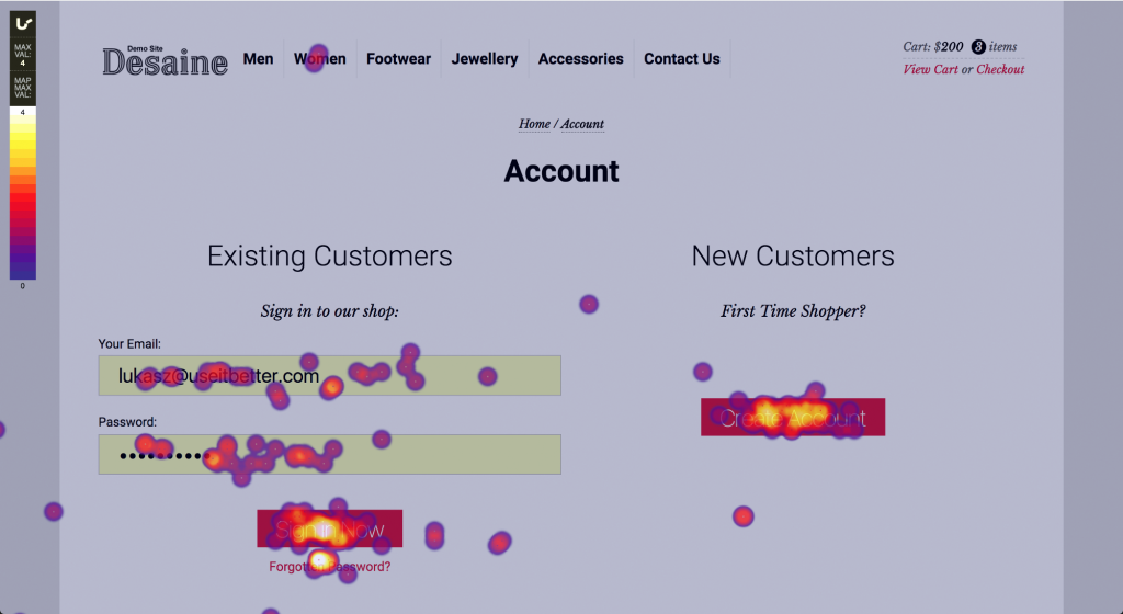
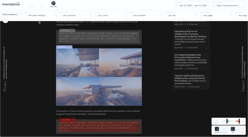
A heatmap of clicks can answer questions about what matters most to users on a page – which elements are most important (key) to them and conversely – what can be discarded to avoid unnecessary visual load. This map also helps identify elements that might appear clickable to users or evoke a desire to explore further. In combination with other maps, click maps can greatly enhance the interface and elevate site conversion.
Move or Attention Heatmaps
Move heatmaps monitor the cursor movement of desktop users while navigating a page. The active zones on a move map indicate the paths users’ cursors have traced across a page. Research suggests a correlation between users’ gaze and cursor movement, implying that a move map provides insight into the probable areas of visual attention as users navigate the page.
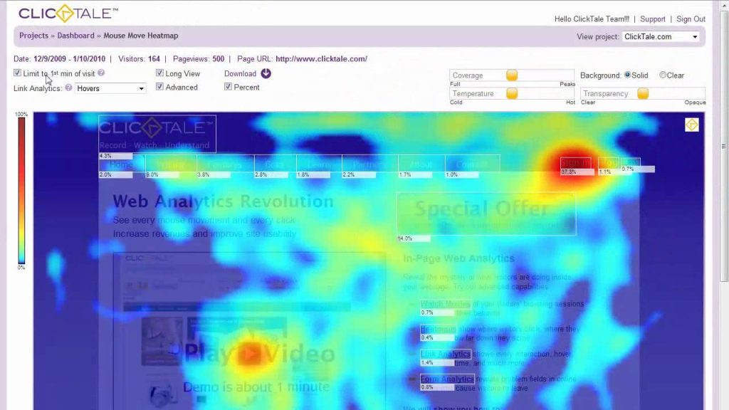
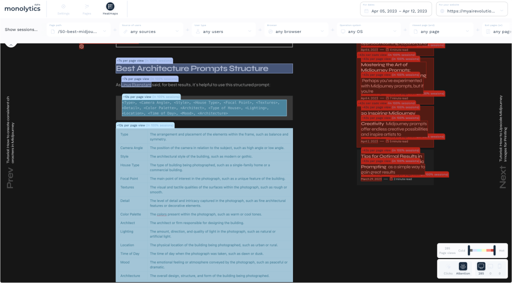
Another tool for tracking user attention is the gaze heatmap. It’s generated by tracking eye movements or through machine learning systems. AI models enable the prediction of points of focus, allowing the creation of a heatmap even during the product/website prototyping phase.
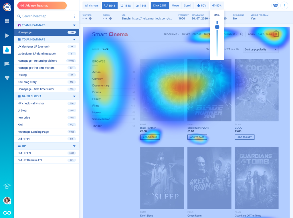
Engagement Heatmaps
Engagement zones merge interaction data from click, scroll, and move heatmaps into a streamlined view. The only but significant issue is that heatmaps created based on aggregated diverse data can present a complex picture that’s challenging to analyze.
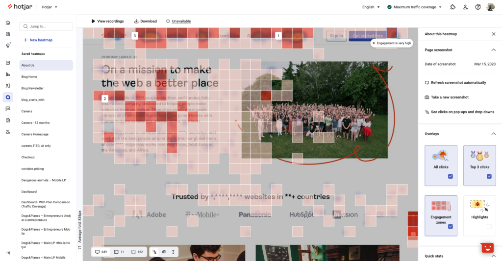
This potent data visualization tool facilitates rapid page analysis, allowing you to swiftly obtain a comprehensive perspective of user engagement with your product.
When analyzing user behavior, it’s extremely important to combine information from different types of heatmaps – click maps, attention maps, and so on. Additionally, conducting research across various user groups is crucial – the behavioral scenarios of different user groups can vary significantly.
What to do after a heatmap shows friction
A heatmap is a starting point, not a conclusion. Once the visual pattern suggests hesitation, weak attention, or ignored interface elements, the next step should depend on what kind of question the team needs to answer.
- Use heuristic analysis when the team needs a structured expert review of the interface itself.
- Use usability testing when the team needs direct task evidence from real users.
- Use Monolytics Records when the pattern appears on one high-intent journey and the team needs the exact failed sessions.
- Use Monolytics Research when the pattern needs to be checked across repeated sessions instead of one replay sample.
Related page-friction guides
Heatmaps show that attention or interaction is wrong; the next guide should explain why the user is hesitating in that exact moment.
- Why users ignore primary CTA buttons when the pattern is visible on a conversion CTA.
- Diagnose rage clicks on demo request pages when the page looks clickable but the interaction fails.
- Why pricing-page traffic does not convert into trials when attention reaches the page but commitment still drops.


