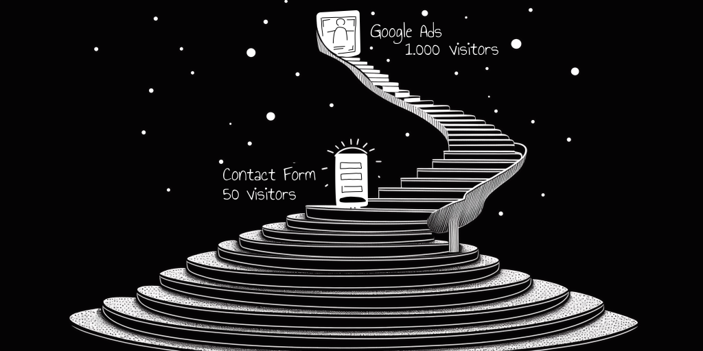
To answer this question, it’s essential to first recall the purpose for which your website was created. In most cases, websites are built to provide your company with another avenue to gather leads. With this in mind, analyzing website effectiveness can be simplified: the higher the percentage of site visitors leaving their contact details, the more effective the site. In essence, it all comes down to analyzing the conversion rate (number of conversions / number of visitors). If only it were that straightforward.
Our logic is partially correct, but only to an extent. Why?
Imagine a classic scenario: a Google Ads campaign drives 1000 visitors to our site. Let’s say 5% of them left their contact details, which is 50 visitors. What do these figures really tell us? Almost nothing. We’re merely stating the fact that 5% of visitors left their contact details within a specific time frame.

Sure, we can slightly enhance our analysis by considering the conversion rate dynamically. This way, we can see whether this metric is improving over time or, conversely, deteriorating. However, even this analysis is somewhat limited. Let’s say we notice a deterioration – then what? How do we understand why it’s happening? How do we enhance our conversion rate?
If you’re currently in the process of seeking answers to these questions, then this article is precisely for you. Note that the topic of website effectiveness analysis is quite extensive and also depends on the type of site, whether it’s a landing page, an online store, a service site, etc. Since attempting to cover all nuances for all types of sites would be more akin to writing a book, today we’ll focus specifically on the analysis of landing pages.
So, we’ve arrived at the question that interests us: “How do we improve our conversion rate?” To answer this question, we typically need to analyze two segments of visitors:
- Those who left their contact details, essentially completing a conversion. Here, it’s important to pay attention to what engaged them during their visit and then attempt to emphasize that aspect on the landing page to capture more users’ attention.
- Those who exited our landing page without providing their details. We need to understand at what stage of interacting with the landing page they left.
Let’s start with the first segment. How can we comprehend what caught the attention of these converting visitors? Of course, we can use various analytics systems to track specific user actions, such as clicks on elements, video views, or interactions with forms. However, there’s a catch: these events are typically tracked if the user interacts with a specific element on the site, like clicking or starting to input characters into a form field. Yet, a landing page might also contain blocks of textual information. What do we do in such cases? How do we understand if users who left their contact details interacted with these text blocks? Did they read this information?
In this case, many marketers turn to scrolling maps. These show what percentage of users scroll the page to a certain stage, allowing you to understand whether anyone saw your block or not. However, scrolling maps only show if a user scrolled to a certain block and don’t indicate how much time they interacted with it. The best solution in this scenario is to utilize an Attention Map. This map reveals how much time a user spent interacting with each element on the page. By adding a filter for users who left their contact details, you can quickly understand which content they paid attention to and what was less important to them.
By supplementing this with Click Maps and using a similar filter, you obtain a comprehensible picture of user behavior on the site, particularly from those who converted.
Note: You must understand that Attention Maps and Click Maps won’t show you every user interaction. For certain actions, like video views or interactions with form fields, you may need to use Google Analytics or a similar service.
Congratulations, we’ve completed the first part. Now we know what actions users who converted take. The next step is to comprehend what’s happening with users who left our landing page without converting.
The logic here is similar. We again need to understand how they interacted with the blocks on our landing page and compare their behavior pattern with those who did convert.
Simply tagging our landing page with Google Analytics events isn’t enough here either. Here’s a straightforward example: imagine a block of text with a button, but users aren’t clicking the button. How can we determine if they’re not clicking because they’re not reading the block or because they’re not even seeing it?
An answer to this dilemma can partly be found in scroll maps. They help understand whether users have scrolled to a specific block, but they won’t reveal how much time they spent with it. To truly understand whether users interacted with specific blocks, an Attention Map is invaluable. This map displays how much time users spent with each element on the page. By using a filter for users who left their contact details, you can quickly grasp which content drew their attention and what was less engaging.
If you add Click Maps to this mix and apply a similar filter, you’ll have a fairly clear picture of how users behaved on your site, especially those who didn’t convert.
Note: You should recognize that Attention Maps and Click Maps won’t capture all user interactions. For specific actions, such as video views or form field interactions, you might also need to leverage Google Analytics or a similar service.
Well, there you have it – using just three tools: Attention Map, Click Map, and event tracking in Google Analytics, you can answer a significant portion of questions related to the broader topic of website effectiveness.
If you found this material helpful, feel free to share it on your social media platforms. We would greatly appreciate it.)


