When a page attracts the right visitors but the primary CTA still gets ignored, the problem is usually not “traffic quality” in the abstract. It is a mismatch between user intent and what the page makes easy to notice, trust, and act on. A visitor may be interested, may scroll deep enough to understand the offer, and may still leave because the main action never earns enough attention or commitment.
If you want to diagnose why users ignore primary CTA buttons, the goal is not to change button color and hope for a lift. The goal is to identify the exact failure mode: weak hierarchy, vague copy, poor timing, trust gaps, competing actions, or a page narrative that does not justify the click. Once you know which of those is happening, the fix becomes much more precise.
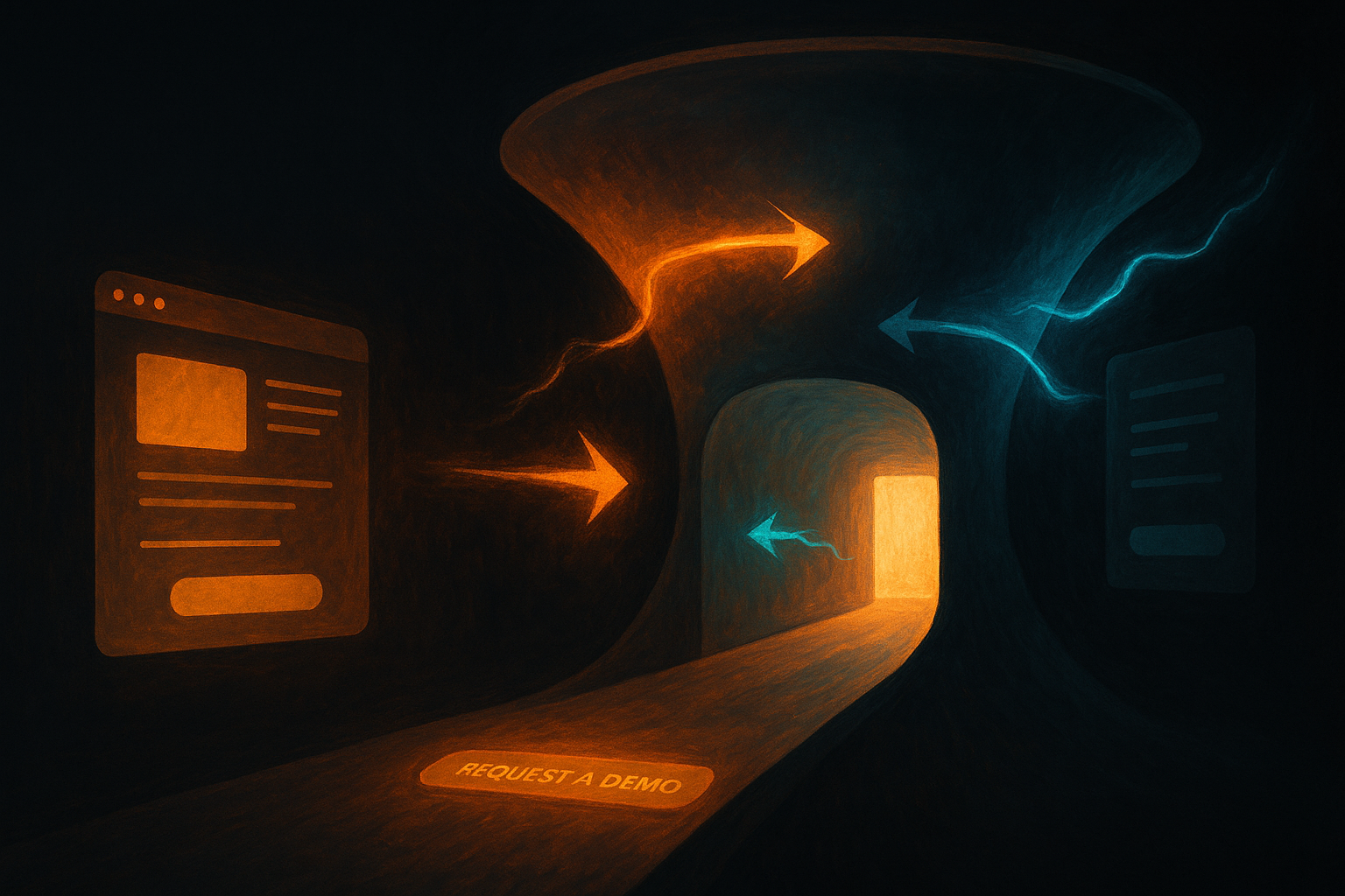
What the problem looks like in real sessions
On high-intent pages such as pricing pages, demo request pages, product comparison pages, or bottom-funnel landing pages, CTA avoidance usually looks like one of a few patterns:
- users scroll through the offer, proof, and pricing but never interact with the primary action
- users hover around the CTA area, then move away and continue reading or leave
- users click secondary links, navigation, or footer items instead of the main conversion path
- users interact with trust content, FAQs, or testimonials repeatedly because they are still trying to resolve risk
- users show broad engagement on the page but there is no meaningful CTA click-through at the end
These are not all the same problem. Some mean the CTA is visually weak. Others mean the reader is unconvinced. Others mean the next step feels too expensive relative to the information the page gives.
Why this matters more than most teams assume
Primary CTA underperformance is a leverage issue. If the page already attracts relevant traffic, every lost click means you are leaking demand at the point where the journey should become measurable business value. That affects conversion rates directly, but it also affects how you interpret the rest of the funnel. Teams sometimes over-invest in acquisition or redesign work when the more immediate issue is that the page never made the main action compelling enough.
On high-intent pages, the CTA is not just a button. It is the summary of the whole page argument. If users ignore it, the page is signaling one of two things: either the next step is not attractive enough, or the page has not earned the click.
The most common root causes
1. Weak visual hierarchy
The CTA exists, but it does not dominate the decision point. This happens when the button color blends into the surrounding layout, when nearby elements compete harder for attention, or when the CTA appears in a visually crowded section. In these cases, the visitor does not necessarily reject the offer. They simply are not guided clearly enough toward the next step.
2. Vague or low-commitment copy
Copy such as “Learn more” or “Get started” often underperforms on high-intent pages because it hides the value of the next step. If the page is asking for a demo request, a trial, or a product conversation, the user wants to know what happens next and why it is worth doing now.
3. The page introduces too many competing actions
When the main CTA sits next to several secondary links, alternate destinations, or product-tour options, users may postpone the main commitment and continue exploring instead. Exploration is not always healthy. On strong-intent pages, too many escape paths can quietly suppress the main conversion route.
4. Trust is not resolved before the action point
Some users ignore a CTA because they still have unanswered questions about pricing, implementation effort, data privacy, or fit. The button can be perfectly visible and still go untouched if the page has not earned enough confidence before asking for commitment.
5. The next step feels larger than the page suggests
A CTA to request a demo may be ignored because the page makes the action feel like a sales call instead of a useful next step. Likewise, a trial CTA may underperform if the page suggests setup effort, unclear onboarding, or a risk of wasted time. The issue is not the button itself. The issue is the implied cost of clicking it.
How to confirm the issue instead of guessing
Start with behavioral evidence. Review the page with three questions in mind:
- Do users reach the CTA with enough context to make a decision?
- What do they do immediately before they choose not to click?
- Which nearby elements absorb attention instead?
Session evidence is the fastest way to separate visibility problems from persuasion problems. If visitors never pause near the CTA and scroll past it, hierarchy may be weak. If they pause, move the cursor around, revisit proof sections, or click FAQs, trust resolution is probably the issue. If they repeatedly open navigation or secondary links, the page may be giving them too many alternative paths.
This is where complementary methods matter. A heuristic pass can reveal hierarchy and copy problems that are visible before a user even arrives. If you have not reviewed the page structurally, start with a short checklist like the one in How to Conduct a Heuristic Analysis That Finds Real UX Issues.
What to look for in session data
- Scroll depth: are visitors actually reaching the CTA block?
- Dwell patterns: do they slow down near the CTA or move through it quickly?
- Cursor behavior: is there hesitation around the CTA or around nearby trust elements?
- Secondary interaction pull: are they choosing tabs, nav links, or docs instead?
- Device differences: does the CTA feel less visible or more crowded on mobile?
If your page attracts enough traffic but the CTA stays quiet, compare high-engagement no-click sessions with sessions that do click through. The differences are often more instructive than averages. One cohort may reach the CTA earlier because the page makes the offer obvious. Another may drift because the narrative buries the reason to act.
When short feedback is useful
If behavior points to hesitation but not to a clear cause, add a lightweight prompt. Ask visitors one direct question near exit or after a period of inactivity: “What is stopping you from taking the next step?” The response does not need to be statistically elegant to be useful. If several users mention unclear pricing, uncertainty about the demo, or lack of proof, you now have much stronger evidence for what the CTA is competing against.
Pages that struggle with CTA engagement often also struggle with broader UX clarity. If the page feels hard to scan or overloaded, the issue may sit higher in the page structure itself. In that case, the broader friction patterns outlined in How to Improve UX Design: 10 Changes That Reduce Friction can help frame the fix sequence.
How to prioritize fixes
Not every CTA issue deserves the same urgency. Use a simple ranking model:
- Page value: is this page close to revenue, activation, or demo conversion?
- Traffic quality: are these visitors already high-intent?
- Evidence strength: do sessions and feedback point to the same issue?
- Fix effort: is the likely change copy, layout, trust content, or full-page restructuring?
A CTA with weak copy on a high-intent pricing page usually deserves faster action than a visually imperfect button on a lower-intent blog article. Prioritize where intent and business value are already present.
A practical fix checklist
- Make the CTA visually dominant at the actual decision point.
- Rewrite the CTA copy to describe the next step clearly.
- Reduce competing actions near the main conversion path.
- Move the most important trust answers closer to the CTA.
- Check the mobile layout separately; crowded mobile sections often hide urgency.
- Review the implied commitment of the next step and soften unnecessary risk.
- Test one change at a time when possible, so the evidence stays interpretable.
Where Monolytics helps
Monolytics is useful when you need more than a heatmap-level guess. Use it to isolate high-intent sessions on the affected page, compare clicked versus ignored CTA journeys, and add a short feedback layer when hesitation is visible but the cause is still unclear. That gives product, design, and growth a common evidence base instead of a debate about button color.
The key point is that CTA avoidance is rarely random. Users usually tell you what is wrong through behavior before they ever tell you through words. If the page already earns attention but not action, the next job is not broad optimization. It is to identify the specific reason the click never became worth it.